Available for Full-Time Job
Empathia Employee Assistance Program (EAP) Site Redesign
Modernizing Employee Assistance Programs for Enhanced Usability and Engagement
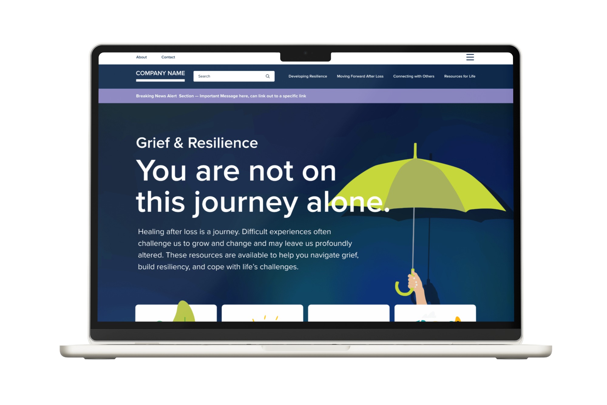
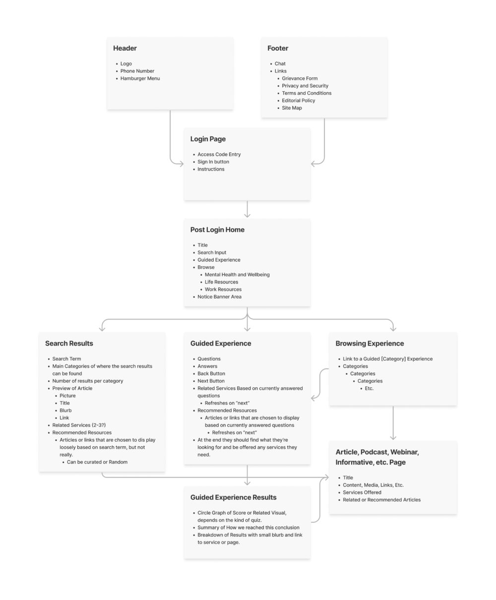
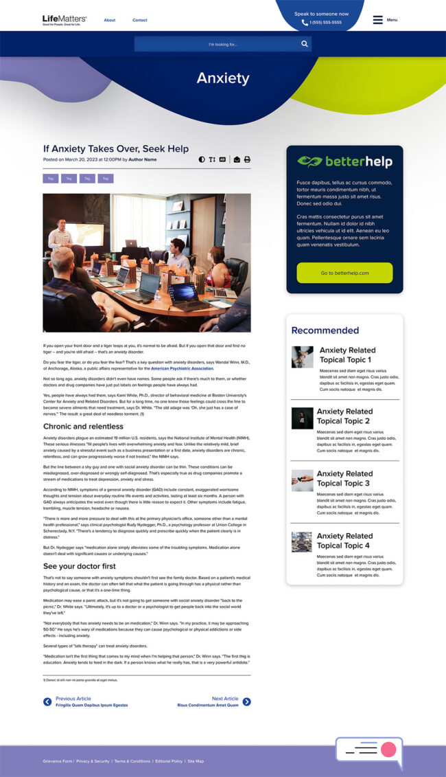
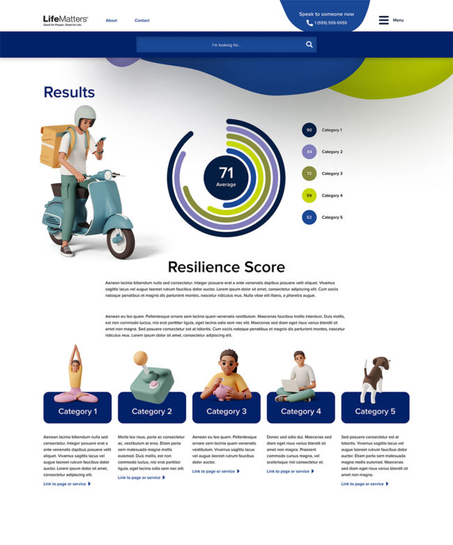
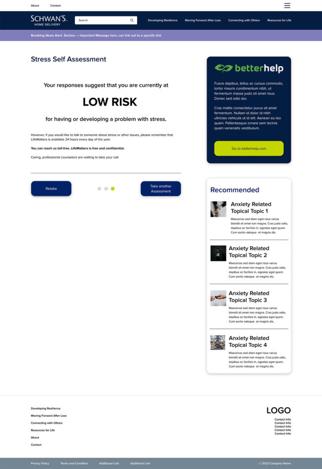
Empathia needed to modernize its EAP systems to look more appealing and easier to use. The project aimed to create a guided system, a browsing interface, and a quiz-like feature, making mental health and health resources easily navigable and user-friendly.
Role
Lead UX Designer
Client
Empathia
Timeline
6 Months to a Year
Project Overview
In the Empathia EAP site project, I served as the Senior UX Designer, as well as the UI and Web Designer. The client, Empathia, needed to modernize its Employee Assistance Program (EAP) systems to make them more appealing and user-friendly. The project spanned approximately six months.
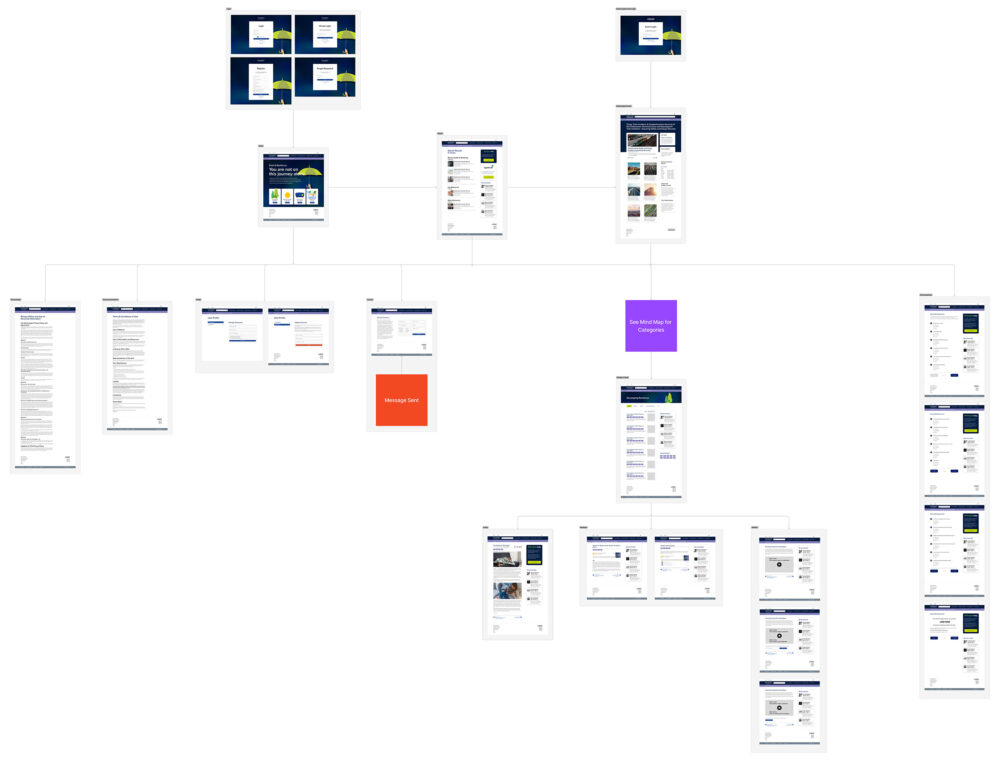
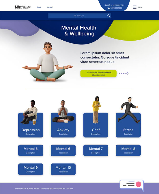
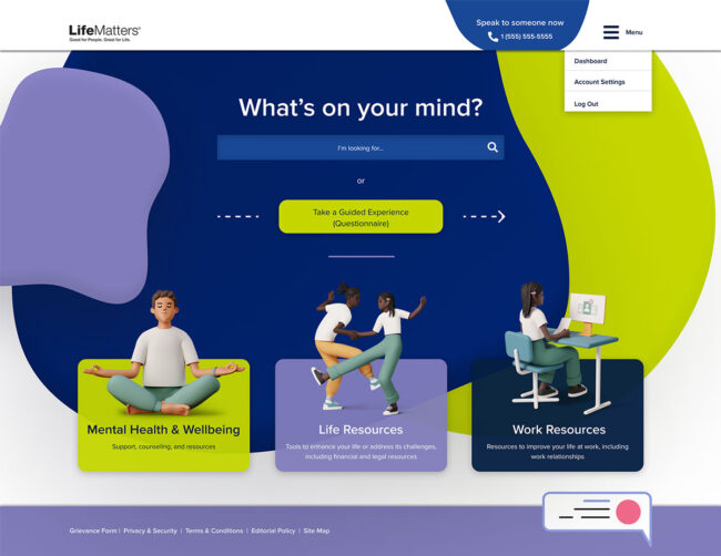
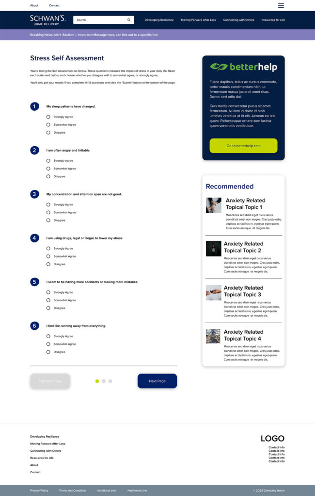
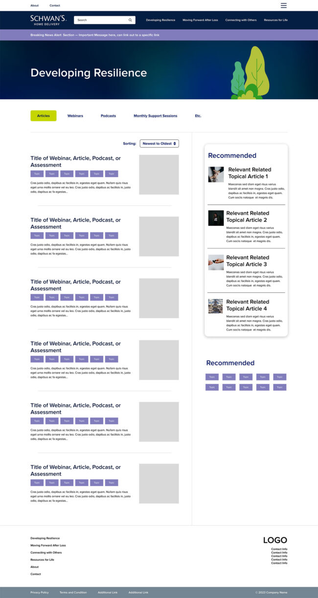
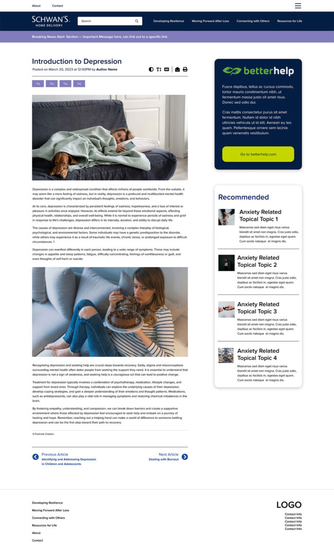
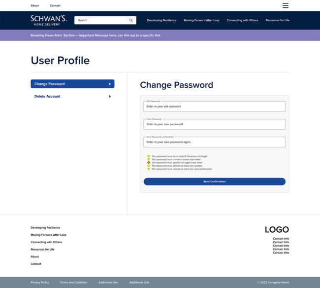
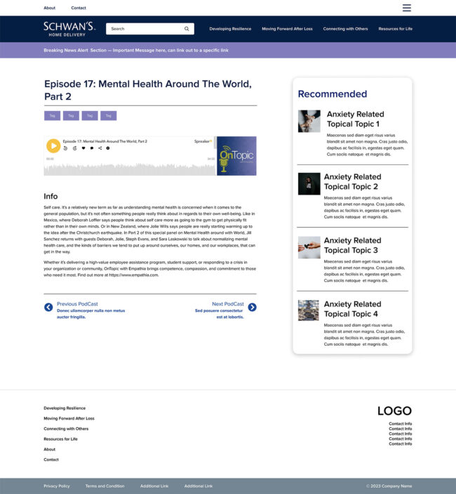
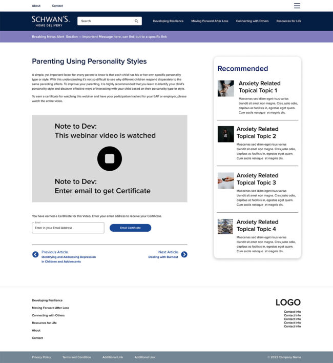
Empathia aimed to create three systems: a guided system, a browsing area, and a quiz to help users find relevant resources. The site contained numerous articles about mental health and wellness that needed to be easy to navigate and use. My role involved creating a dashboard and redesigning all pages to ensure smooth navigation and optimized user experience, reducing friction. The design was then handed off to developers for implementation. Working in an agile environment, we provided developers with the necessary elements as requested to meet tight deadlines.
Problem Statement
Empathia’s existing EAP systems had an outdated design and were difficult to navigate. Users struggled to access the resources they needed, resulting in low engagement and satisfaction. The systems lacked intuitive user flows and had significant friction points that hindered the overall user experience.
The primary goals of the redesign were to modernize the EAP systems, making them more visually appealing and easier to use. Specific objectives included creating a guided system for step-by-step navigation, developing a browsing feature for easy content exploration, implementing a quiz system for personalized resource recommendations, ensuring easy navigation of articles on mental health and wellness, and designing a user-friendly dashboard. Our agile environment allowed us to deliver components quickly to developers.
Challenges
- Outdated design
- Difficult navigation
- Low user engagement
- Lack of intuitive user flows
- Significant friction points
Objectives
- Modernize the EAP systems
- Improve usability
- Create a user-friendly dashboard
Research
To gather user insights and data, I employed various methods. I conducted interviews with end users from client companies to understand their usage patterns and pain points. I also spoke with HR representatives managing the EAP system to gather their insights on system selection, management, and employee engagement. Additionally, I engaged with Empathia’s internal team to understand their challenges in selling and managing the EAP system and consulted potential clients interested in adopting an EAP system to identify their needs and expectations. I reviewed other EAP systems and non-EAP systems featuring quizzes and guided interfaces to benchmark best practices and innovative features.
The research revealed several critical barriers and insights. Users did not fully trust the EAP system, often doubting its confidentiality and effectiveness. The existing system required users to navigate through too many steps and choices, leading to frustration and abandonment. Users often received recommendations that did not match their needs, leading to disengagement. Employees frequently forgot about the EAP system after their initial login, indicating a lack of ongoing engagement and visibility. The system felt generic and failed to provide a personalized user experience. Empathia struggled to manage the extensive library of articles and resources, making it difficult to update and maintain relevant content. The system’s simple code-based login method was insufficient for companies that required more personalized access and content customization for individual employees.
Methods
- Interviews with end users, HR representatives, and potential clients
- Competitive analysis of other EAP and non-EAP systems
Challenges
- Lack of trust
- Complexity and friction
- Irrelevant results
- Forgetfulness of the EAP system
- Impersonal experience
- Content management challenges
- Permission issues
Design Process
Personas
To guide the design process, I developed several detailed personas representing the diverse user base. Each persona included demographic information, psychographics, pain points, and user environments. These personas ensured that the needs of different user types were addressed throughout the project.
HR Employee David
David is a 34-year-old HR Manager responsible for managing the EAP system and accessing reports. He is interested in teaching the EAP system to users and applies EAP items as a traditional user. His pain points include difficulty engaging employees, managing technical issues, and ensuring the confidentiality and privacy of employee data. David works from the office using a desktop and handles many HR duties at a mid-size company.
Extrovert Employee Cicely
Cicely is a 32-year-old manager at Toyota, who frequently updates herself about the EAP system to manage work-related emotional stress. She suffers from emotional stress from work, is open to asking questions from HR, and appreciates online privacy. Her pain points include not receiving regular updates about the EAP system, privacy concerns, and finding relevant resources. Cicely uses a laptop at the office and home, preferring quick access to information.

Introvert Employee Lucas
Lucas is a 45-year-old line worker at Clorox, who avoids seeking help and looks for quick information online. He suffers from physical and emotional stress, avoids talking about emotional stress, and looks for quick information without much effort. His pain points include struggling with physical and emotional stress, limited knowledge about available resources, and unfamiliarity with websites. Lucas uses an older desktop in a factory shared office.

Sheepish Employee Nieve
Nieve is a 34-year-old non-binary employee who works remotely at home and coffee shops. They are shy and hesitant to seek mental health support, feeling like they suffer from Imposter Syndrome. Nieve prefers text/email communication and appreciates online privacy. Their pain points include uncertainty about the legitimacy of the EAP service, fear of being judged, and limited knowledge about the EAP system. Nieve uses a laptop and iPhone.

Grieving Greg
Greg is a 52-year-old construction worker who recently lost his wife. He is seeking discreet emotional support and prefers online resources due to perceived shame. Greg’s pain points include difficulty finding discreet resources, limited availability, and managing grief-related symptoms. He uses a laptop and iPhone at construction sites.
Busy College Caulyne
Caulyne is an 18-year-old college student balancing academic responsibilities with personal life. She is interested in resources for stress and time management, preferring online resources due to a busy schedule. Her pain points include difficulty finding relevant resources, limited availability during business hours, and managing a limited budget. Caulyne uses a laptop and iPhone at class, library, and dorm.

Online-Only College Emily
Emily is a 25-year-old non-binary online student looking for career development and stress management resources. They balance academic responsibilities with part-time work and prefer online resources. Emily’s pain points include limited availability during business hours, feeling overwhelmed and stressed, and seeking career development resources. They use a laptop and iPhone for online courses and work.
Worn College Elder William
William is a 47-year-old social worker pursuing a degree in psychology while balancing work, family, and academic responsibilities. He is interested in resources for academic support and work-life balance, preferring online resources. William’s pain points include juggling full-time work and academic responsibilities, maintaining work-life balance, and feeling isolated in classes. He uses a laptop and iPhone at class, library, and home.
Medical Student Sarah
Sarah is a 33-year-old medical student managing a high academic workload and financial stress. She is interested in resources for academic support and personal wellness, and participates in extracurricular activities. Sarah’s pain points include managing student loan debt, balancing academic responsibilities with personal wellness, and feeling overwhelmed by medical school. She uses a laptop and iPhone at class, library, and parents’ home.
Wireframing and Prototyping
For wireframing and prototyping, I used Figma to create detailed wireframes and interactive prototypes. The process involved creating low-fidelity wireframes to outline the basic structure and layout of the EAP system, focusing on key screens such as the dashboard, guided system, browsing interface, and quiz feature. While I understand the importance of wireframes and the process with the client, it was determined that due to the structure of how the client was making decisions, wireframes were only done internally amongst the team and not shared with the client. I iteratively refined the designs based on stakeholder feedback to improve usability. Interactive prototypes simulated user interactions and flows, used for usability testing and demonstrating design concepts to stakeholders. Design refinements were made based on testing feedback to ensure user-friendliness and project objectives were met.
Visual Design Principles
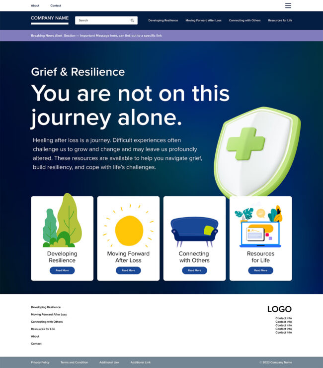
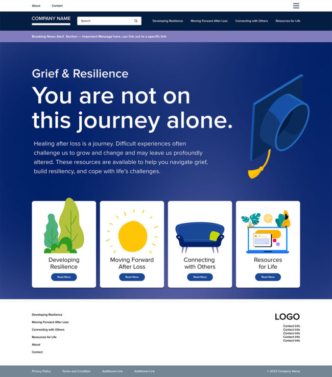
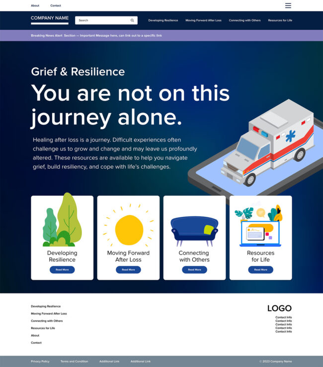
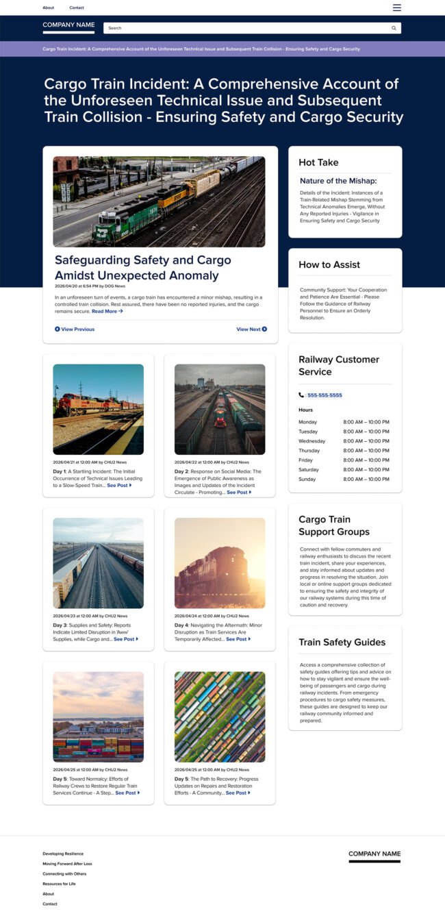
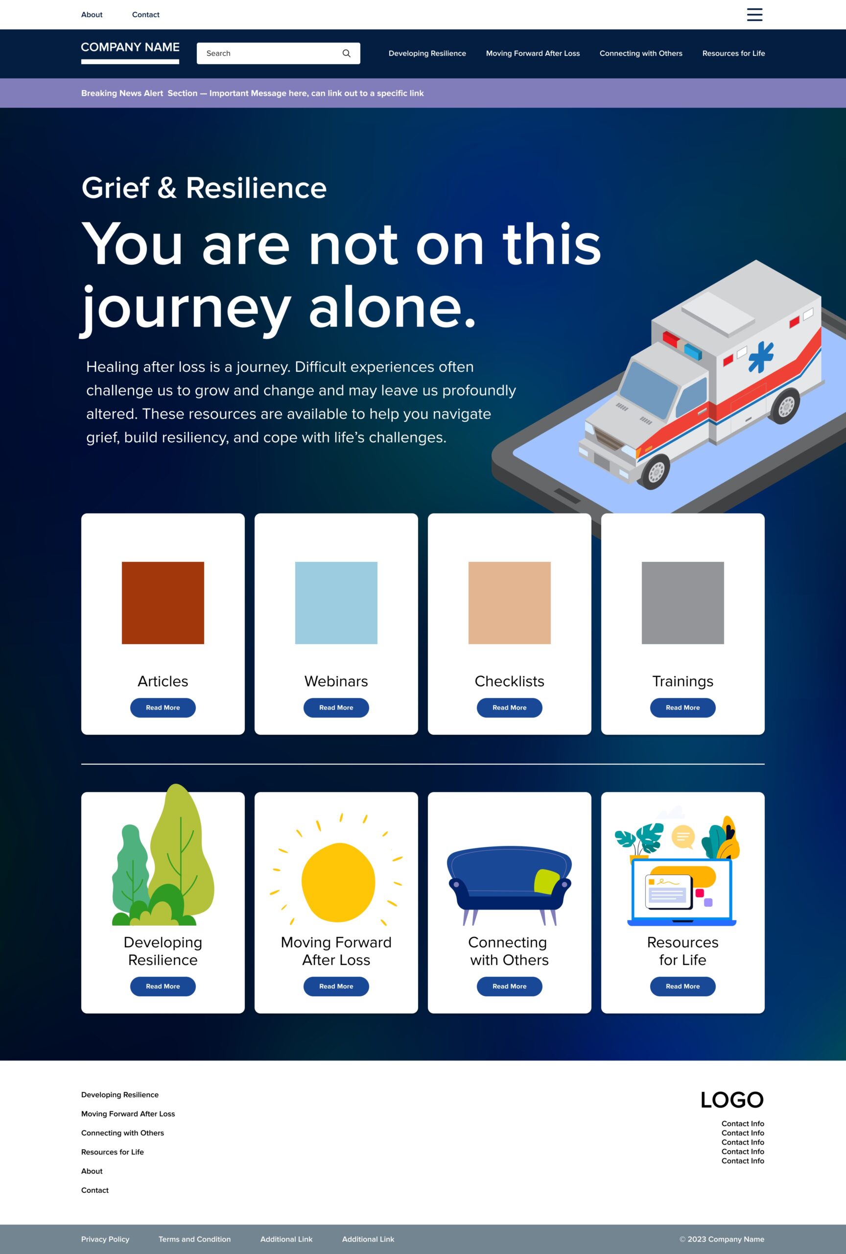
The visual design of the Empathia EAP site focused on creating a modern, clean, and user-friendly interface. Key design principles and aesthetics included consistency, ensuring visual consistency across all pages and elements; accessibility, following WCAG and Section 508 standards to make the system accessible to all users; simplicity, designing an intuitive and straightforward interface to reduce complexity and improve user experience; engagement, using engaging visuals and interactive elements to maintain user interest; and trust, incorporating design elements that conveyed trust and security, such as clear privacy policies and secure login processes.
Design Objectives
- Consistency: Adhered to brand standards for colors and typography, ensuring a cohesive look.
- Accessibility: Followed WCAG and Section 508 standards, with customizable text-sizing and contrast options.
- Simplicity: Focused on a clean, uncluttered design, with future customization for white-labeling.
- Engagement: Integrated interactive components with quirky imagery and illustrations.
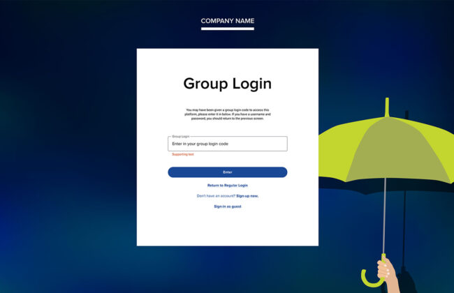
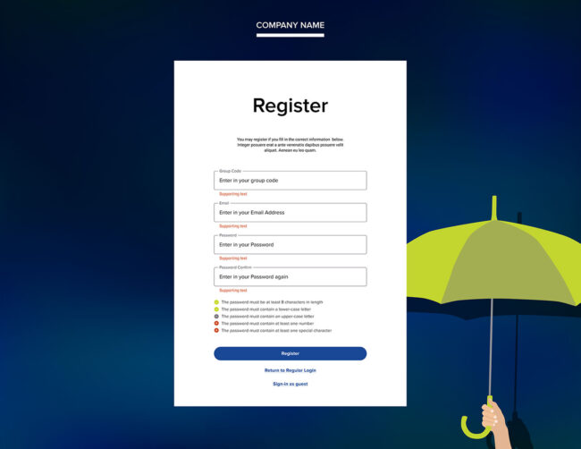
- Trust and Security: Provided clear privacy policies and secure visual indicators.
- Personalization: Implemented a framework for future personalized content and recommendations.
Testing and Iteration
Usability testing was conducted, revealing that improvements were needed in navigation, content relevance, interactivity, and accessibility options. Visual design elements were adjusted based on polarizing feedback. Iterative adjustments were made in collaboration with developers in an agile environment, leading to increased user satisfaction and engagement.
Learnings and Insights
Initial feedback indicated positive client reception, improved ease of use, reduced choice paralysis, and increased engagement with interactive elements. A successful phase one led to Empathia signing another contract for phase two. Detailed quantitative analysis is pending as more end-user data is collected.
Challenges and Solutions
Managed client direction and diverse opinions and adapted to unforeseen changes in project scope
Design Process
Flexibly approached design by jumping straight into comps to guide client direction effectively
Client Interaction
Maintained regular feedback loops and managed client expectations through effective communication
Team Collaboration
Benefited from close collaboration with developers, ensuring seamless workflow and quick adjustments
User Experience
Managed client direction and diverse opinions and adapted to unforeseen changes in project scope
Future Improvements
Built accommodations into the design and documented future plans thoroughly for phase two
Personal Growth
Learned the importance of proactive client assistance and experienced success in a fast-paced project
Conclusion
Although I won’t be personally involved in phase two, the groundwork has been laid for continued success. Future plans include further enhancing personalization and adding new features based on user feedback. Thorough documentation and planning ensure a smooth transition for the project team.
This project highlighted the necessity of proactive client assistance and flexible design approaches. It reinforced the importance of effective communication and collaboration in an agile environment and emphasized the value of understanding diverse user needs for user-centered design projects.
Overall Outcomes and Successes
- Positive feedback on visual design and ease of use
- Reduced choice paralysis
- Increased engagement with interactive elements
- Successful phase one leading to phase two contract
- Improved user satisfaction
Next Steps and Future Plans
- Phase two development
- Continued documentation and planning
- Ongoing agile collaboration
Preparation for Future Challenges
- Enhanced client assistance
- Successful fast-paced project management
- Flexible design approach
- Improved collaboration skills
- Refined user experience strategies
